Minimalism in design is more than a trend—it’s a philosophy rooted in clarity, purpose, and elegance. By eliminating unnecessary elements and focusing on what truly matters, minimalist design creates visuals that are both aesthetically pleasing and highly functional. This section explores the fundamental concepts of minimalism, offering a foundation for mastering this approach in various creative fields.
What is Minimalism in Design?
At its core, minimalism is about simplicity and intention. It involves stripping away superfluous details, ensuring that each design element serves a purpose. Unlike complex, heavily ornamented designs, minimalism focuses on clarity, making it easier for viewers to engage with the content. This design approach spans multiple disciplines, including:
Graphic Design: Minimalist graphic design emphasizes clean lines, simple typography, and limited color palettes, resulting in visuals that convey a message without unnecessary clutter.
Web Design: In web design, minimalism improves user experience by simplifying navigation and reducing distractions, ensuring that users can easily find what they need.
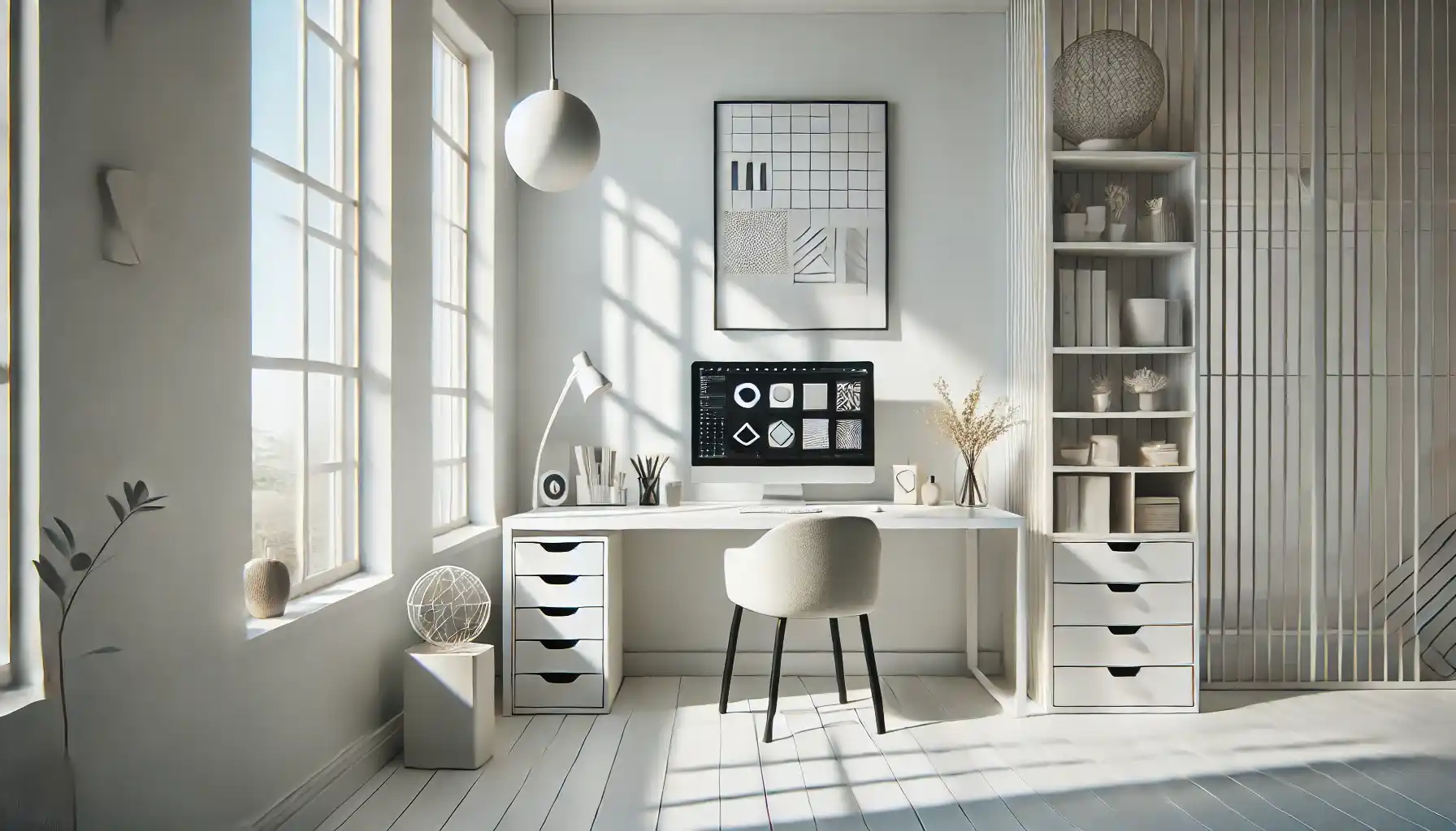
Architecture and Interior Design: Minimalist architecture and interiors focus on clean spaces, functional furniture, and natural light, creating environments that feel open and serene.
By applying minimalist principles across these fields, designers can create cohesive, timeless works that resonate with modern audiences.
Key Principles of Minimalist Design
To truly master minimalist design, it’s essential to understand its guiding principles. These are the building blocks that ensure designs remain simple yet impactful:
Simplicity
Simplicity is the cornerstone of minimalism. This means using the fewest possible elements to achieve the desired effect. Whether it’s a logo, website, or interior space, every element should have a clear role.Design Tip: Stick to a minimal number of colors, fonts, and shapes. Use simple geometric patterns and avoid unnecessary embellishments.
Functionality
In minimalist design, form follows function. Every component must enhance usability rather than distract from it. This principle ensures that the design not only looks good but also works well.Example: A minimalist website should prioritize fast loading times, intuitive navigation, and accessibility. In graphic design, clear communication should take precedence over decorative elements.
Negative Space
Also known as white space, negative space refers to the empty areas between design elements. It provides breathing room, making the layout feel clean and organized. Proper use of negative space enhances focus, guiding the viewer’s attention to key components.Design Tip: Resist the urge to fill every inch of space. Allowing for ample white space creates a balanced, uncluttered look.
Limited Color Palette
Minimalist designs typically use a limited color palette to maintain a cohesive and harmonious look. Designers often select one or two primary colors, complementing them with neutral tones such as black, white, and gray.Example: Many minimalist brands, such as Apple, use a predominantly monochromatic color scheme, relying on pops of color to highlight important elements.
Hierarchy
Establishing a clear visual hierarchy is crucial for guiding the viewer’s attention. This can be achieved by using contrast, size, and placement to emphasize the most important elements first. Without hierarchy, minimalist designs risk appearing too sparse or lacking direction.Design Tip: Use larger fonts or bolder colors for key messages, and ensure supporting elements are secondary in size or tone.
Benefits of Minimalist Design
Minimalist design offers a host of benefits, making it a popular choice across industries:
Enhanced Clarity: By removing distractions, minimalist designs make it easier for viewers to understand the intended message.
Timeless Appeal: Minimalist aesthetics are less likely to go out of style, giving designs a longer lifespan.
Improved Usability: In digital design, minimalism improves user experience by simplifying interactions and reducing cognitive load.
Faster Performance: Minimalist websites tend to load faster due to fewer elements, which improves SEO rankings and user satisfaction.
Practical Tips for Mastering Minimalist Design
Now that we’ve explored the core principles of minimalist design, it’s time to focus on how to put those concepts into practice. Minimalism is not just about removing elements—it’s about being intentional with every choice. In this section, we’ll provide practical, actionable tips for applying minimalism to your design projects, whether you’re working on a website, graphic, or product layout.
1. Start with a Clear Plan
Before diving into a design, take time to plan your approach. Minimalist designs require a thorough understanding of the project’s purpose, target audience, and key message. By defining these elements upfront, you can ensure that every design decision aligns with the project’s goals.
Design Tip: Outline the essential elements you need to include and eliminate anything that doesn’t serve a functional or aesthetic purpose.
Example: When designing a homepage, focus on the core message and primary call-to-action (CTA), and remove secondary or non-essential elements that may clutter the user’s experience.
2. Simplify Your Layout
A clean and intuitive layout is the hallmark of minimalist design. Simplifying your layout means organizing elements in a way that makes it easy for users to navigate and focus on the content.
Remove Clutter: Strip away unnecessary graphics, buttons, and decorative elements that don’t enhance usability.
Group Related Elements: Use negative space to separate content blocks and guide the viewer’s eye from one section to the next.
Use a Grid System: Grids help create structured, well-organized layouts, ensuring that elements are aligned and visually balanced.
3. Use Negative Space Intentionally
Negative space isn’t just empty space—it’s a crucial design element that enhances readability and focus. Proper use of negative space can create a sense of elegance and simplicity, making the design appear more polished.
Design Tip: Don’t be afraid to leave large areas of white space around important elements. This not only draws attention to the content but also prevents visual fatigue.
Example: Apple’s website is a great example of using negative space to highlight key products and CTAs, resulting in a clean, modern aesthetic.
4. Choose a Limited Color Palette
Color plays a critical role in minimalist design, but it should be used sparingly. A well-chosen, limited color palette can create a cohesive and calming visual experience.
Primary and Neutral Colors: Stick to one or two primary colors and complement them with neutral tones like white, black, and gray.
Accent Colors: Use accent colors sparingly to draw attention to specific elements, such as buttons or headings.
Design Tip: Tools like Adobe Color and Coolors can help you create harmonious color palettes that align with minimalist principles.
5. Use Clean, Readable Typography
In minimalist design, typography is often one of the primary elements used to convey information. Therefore, choosing the right fonts and using them correctly is essential for maintaining clarity and simplicity.
Limit Font Choices: Stick to one or two typefaces. Mixing too many fonts can make the design look chaotic and cluttered.
Prioritize Readability: Choose simple, sans-serif fonts for body text, as they are easier to read on screens.
Hierarchy with Font Size: Use font size and weight to establish hierarchy, ensuring that headings stand out while body text remains subtle and clean.
6. Embrace Flat Design
Flat design, characterized by its two-dimensional, clean look, is a perfect match for minimalism. By avoiding complex textures, gradients, and shadows, flat design keeps things simple and modern.
Icons and Buttons: Use flat icons and buttons with simple shapes and solid colors. Avoid unnecessary 3D effects or embellishments.
Consistency: Ensure that all elements, such as icons and illustrations, follow the same flat design style to maintain visual harmony.
7. Be Selective with Images and Graphics
While minimalism often involves fewer images, the ones you do use should be carefully chosen and high-quality. Images in minimalist design serve a purpose beyond aesthetics—they should support the message or enhance the overall composition.
Use High-Resolution Images: Blurry or pixelated images can ruin the clean look of minimalist design. Always use high-resolution, professional photos or illustrations.
Full-Width Images: When using images, opt for full-width layouts with ample negative space around them to create a striking visual impact.
Example: A minimalist portfolio website might feature a single, large hero image on the homepage, with a short description or CTA beneath it.
8. Be Intentional with Every Element
Minimalist design is all about intentionality. Every element, from the typography to the layout, should serve a specific purpose. If an element doesn’t contribute to the overall functionality or message, it’s best to leave it out.
Question Every Addition: Before adding any new element, ask yourself: Does this enhance the user experience? Does it support the primary goal of the design?
Avoid Decorative Features: While decorative elements can be tempting, they often distract from the main message. Focus on functional elements that add value.
9. Establish a Visual Hierarchy
A clear visual hierarchy helps guide the viewer’s eye, ensuring they see the most important information first. In minimalist design, this is especially critical, as fewer elements mean more emphasis on those that remain.
Contrast and Scale: Use contrast in color and size to differentiate between headings, subheadings, and body text.
Placement: Position key elements, such as CTAs, in prominent locations where they are easily noticed.
Design Tip: F-pattern and Z-pattern layouts are common strategies for guiding users through a minimalist webpage.
10. Test and Iterate
Minimalist design might appear simple, but achieving the perfect balance between simplicity and functionality can be challenging. Testing and iteration are key to refining your design.
A/B Testing: Experiment with different layouts, colors, and font sizes to see what works best for your audience.
Gather Feedback: Seek feedback from users or colleagues to gain insights on how your design is perceived.
Iterate: Based on the feedback and data collected, make necessary changes to enhance usability and aesthetics.

Real-World Applications of Minimalist Design
Minimalist design is a versatile approach that can be applied across a wide range of creative fields. From branding and digital products to architecture and motion graphics, minimalism continues to influence how we interact with visual content. In this section, we’ll explore real-world examples of minimalist design in various industries and draw key insights from successful applications.
1. Minimalist Branding: Less is More
In branding, minimalist design helps create memorable and timeless logos. By focusing on simple forms and clean lines, minimalist logos convey clarity and professionalism. Some of the world’s most recognizable brands have embraced minimalism in their visual identity, including:
Apple: Known for its clean, sleek aesthetic, Apple’s minimalist logo and product design have become synonymous with innovation and sophistication.
Nike: The iconic swoosh logo is a perfect example of minimalist design, representing motion and athleticism in a single, simple shape.
Google: Over time, Google has simplified its logo by removing unnecessary elements and opting for a flat design with a limited color palette.
Key Insight: When designing a logo or brand identity, focus on creating something that is simple yet distinctive. Use negative space creatively and ensure the design remains effective in both color and monochrome formats.
2. Minimalist Web Design: Enhancing User Experience
Web design is one of the most prominent areas where minimalism is applied, as it directly impacts user experience (UX) and accessibility. Minimalist websites prioritize intuitive navigation, fast loading times, and responsive design, offering users a seamless browsing experience.
Example 1: Airbnb
Airbnb’s website is a masterclass in minimalist design. With a clean layout, ample negative space, and clear CTAs, it allows users to focus on finding accommodations without distractions.
Example 2: Dropbox
Dropbox’s homepage features a minimalist design with a bold headline, a simple illustration, and a prominent CTA button. The use of negative space ensures that the key message is immediately noticeable.
Key Insight: When designing a website, focus on what’s essential for the user. Ensure that navigation is simple, CTAs are clear, and content is easy to digest. Avoid clutter and prioritize usability.
3. Minimalist Graphic Design: Making an Impact with Less
In graphic design, minimalism ensures that the message is delivered without unnecessary distractions. Whether it’s a poster, social media graphic, or print ad, minimalist designs rely on bold typography, simple layouts, and intentional use of color.
Example:
A poster promoting an art exhibit might use a single striking image, a bold title, and minimal text. This approach draws attention to the key information without overwhelming the viewer.
Key Insight: In graphic design, focus on one or two main elements. Use bold typography to create hierarchy and maintain balance with negative space.
4. Minimalist Product Design: Functionality Meets Aesthetics
Minimalism is often at the core of product design, where simplicity and functionality are paramount. Companies that produce physical products, such as furniture, gadgets, and home appliances, frequently adopt minimalist principles to create items that are both beautiful and practical.
Example:
The Scandinavian furniture brand IKEA incorporates minimalist design in many of its products. With clean lines, neutral colors, and a focus on functionality, their furniture pieces are designed to fit seamlessly into various interior styles.
Key Insight: In product design, every element should serve a purpose. Avoid adding decorative features that don’t enhance usability, and focus on creating a seamless user experience.
5. Minimalist Motion Graphics: Telling a Story Through Simplicity
In motion graphics, minimalism can be highly effective in conveying complex ideas through simple visuals. By using flat design elements, clean transitions, and a limited color palette, minimalist motion graphics help audiences focus on the core message.
Example:
Corporate explainer videos often use minimalist motion graphics to present data or explain processes in an engaging way. The lack of unnecessary visual effects ensures that viewers remain focused on the content.
Key Insight: In motion graphics, prioritize clarity and flow. Use smooth transitions, consistent iconography, and a cohesive color scheme to maintain a clean, professional look.
How Minimalism Enhances Creativity
Contrary to popular belief, minimalism doesn’t limit creativity—it enhances it. By working within constraints, designers are encouraged to think more critically about each element they include. This approach leads to more thoughtful, intentional designs that effectively communicate the desired message.
Minimalism also fosters innovation by encouraging designers to experiment with negative space, typography, and unconventional layouts. Instead of relying on decorative elements, they focus on creating impact through simplicity and balance.
Conclusion
Mastering minimalist design is about more than just removing elements—it’s about understanding what truly matters and using that knowledge to create visually striking, functional designs. From branding and web design to product development and motion graphics, minimalism offers a timeless, versatile approach that enhances clarity and usability.
By applying the principles and tips outlined in this guide, you can create minimalist designs that stand out in a crowded visual landscape. Remember, minimalism isn’t about doing less—it’s about doing more with less. Whether you’re designing a logo, a website, or a marketing campaign, adopting a minimalist mindset will help you craft visuals that are not only beautiful but also highly effective.